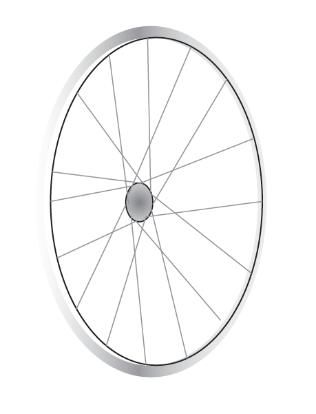
Today I did an illustration based on the word "Wheel" from Illustration Friday,
I enjoy riding and working on bicycles, and I wanted to do something bike-related.
I decided to come up with a Bike shop called Spokes, and I would illustrate a detailed, yet clean-looking bicycle wheel with spokes to feature in my logo design.
First, I had to create the rim of the wheel. I decided I wanted to make the wheel facing on an angle, so I arranged a few different sized ovals and filled with different gradients to look like metal, and to show a little perspective.
Next, I made 2 overlapping ovals in the middle of the wheel for the hub flanges, where my spokes will be attached to.
Referencing a picture of a 32-spoke wheel, I figured out the spoke pattern and made the spokes on the facing side of the wheel green. I made a 1pt oval around the "middle" of the rim where the spokes connected so that I had somewhere to end my lines and make sure all the spokes are in line.
I duplicated and flipped the green spoke patter and made it pink, so that I could make adjustments easily and not get the 2 sides confused.
When I was happy with my spokes, I applied a gradient to the hub to make it look rounded. I decided to leave the axle out of the illustration because I wanted the logo to focus on the spokes, and it seemed like an unnecessary detail. Now I made the spokes on the facing side grey, and the spokes on the other side black, so that they appear farther away.
I wanted to give it an extra touch as well as the wheel, so I was experimenting with some lines, going through the wheel, etc.
I thought it would be better to make the S's long and put the information (Bike shop, est. 2013) in the exteneded part.
And here we have my final product!Thank you for reading,
Matt


No comments:
Post a Comment