Saturday 13 April 2013

"Wheel" Illustration - Spokes Bike Shop logo

Hello Everyone,

Today I did an illustration based on the word "Wheel" from Illustration Friday,

I enjoy riding and working on bicycles, and I wanted to do something bike-related.

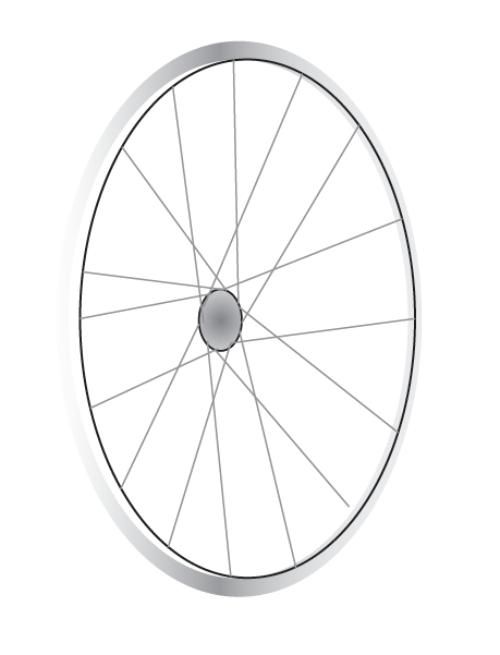
I decided to come up with a Bike shop called Spokes, and I would illustrate a detailed, yet clean-looking bicycle wheel with spokes to feature in my logo design.

First, I had to create the rim of the wheel. I decided I wanted to make the wheel facing on an angle, so I arranged a few different sized ovals and filled with different gradients to look like metal, and to show a little perspective.

 Next, I made 2 overlapping ovals in the middle of the wheel for the hub flanges, where my spokes will be attached to.
Referencing a picture of a 32-spoke wheel, I figured out the spoke pattern and made the spokes on the facing side of the wheel green. I made a 1pt oval around the "middle" of the rim where the spokes connected so that I had somewhere to end my lines and make sure all the spokes are in line.
 I duplicated and flipped the green spoke patter and made it pink, so that I could make adjustments easily and not get the 2 sides confused.
 When I was happy with my spokes, I applied a gradient to the hub  to make it look rounded. I decided to leave the axle out of the illustration because I wanted the logo to focus on the spokes, and it seemed like an unnecessary detail. Now I made the spokes on the facing side grey, and the spokes on the other side black, so that they appear farther away.


 Omce I was happy with how my wheel looked, I decided to add my lettering. I figured the best idea would be to use the wheel as sort of a ligature, and replace the O in Spoke with it.

 I  wanted to give it an extra touch as well as the wheel, so I was experimenting with some lines, going through the wheel, etc. 

I thought it would be better to make the S's long and put the information (Bike shop, est. 2013) in the exteneded part.
And here we have my final product!

Thank you for reading,

Matt


Friday 5 April 2013

"Wings" Illustration - Wing's Cafe

Hello Everybody,

For this post, I chose the word "Wings" to base my Logo on.
Many logos incorporate wings into their design, as you can see here:
http://blog.spoongraphics.co.uk/articles/inspirational-showcase-of-logo-designs-with-wings
I wanted to do something you might not expect to see wings on, so I chose to do a Coffee Shop.

I started drawing and experimenting with different styles of wings, and came up with this design, because I wanted something simple and clean looking.


 Next, I vectorized my drawing in Adobe Illustrator:


I duplicated the wing so I had a set of 2 identical wings:


I then illustrated a cup of coffee to put my wings onto:

 I then tried placing this ring I made, which resembles a ring left from a cup of coffee on a table, in different sizes and different placements to see where it might work best.
I added some shading and detail to the cup and the wings to make the logo pop a little more.
I decided to make the ring large around the cup, to give the design a better shape.
Next, I added the name of the Coffee shop, "Wing's Cafe" to bring it all together.

Here we have it, my final logo design.

Thanks for reading, stay tuned for my next logo design!

Matt

Monday 21 January 2013

"Ocean" Illustration - Tidal Wave Records Logo

Hey Everyone!

I have been doodling in my notebook trying to come up with a creative way to Construct a logo around the word Ocean.

First, I wrote down a bunch of ideas that would make for a trendy business who would be seeking a sharp, dynamic Logo.
I came up with "Ocean Sounds Records" with either a Record Label or a Record Store in mind.

I wanted to do a logo involving a vinyl record, because nothing beats Vinyl!

 Thumbnail Stage:

Here is my first idea:

I was trying to work out a way to incorporate a cool looking wave (Ocean Sounds) with a record player, So I first drew up this wave crashing over a record player, with "OCEAN SOUNDS" in Watery Letters. Not Bad, but not that good either.

My second Sketch:
Here, I was trying to work out a way to shape the Watery letters around the wave, while also trying to perfect my Wave-drawing abilities. Another thing I did here was experiment with a ribbon/banner along the bottom where it says "Records". I feel banners are a nice touch on most logos, as they give it an "Official" look.

Third Times a Charm?

Realizing that the Illustration only needed the Ocean Theme, and not necessarily the Word Ocean in the graphic, I tried out some different words. I did a quick, but planned out sketch of a Typographic Wave, composed of the words "Tidal Wave" I want this logo to be complex, yet simple. By that I mean I want detail and the record player, funky looking letters, and one colour (Blue of course!).
So, I went to my weapon of choice, Adobe Illustrator, and Tried out this new twist on my idea.
Still a work in Progress, but I am happy with how my letters turned out!

 I decided to go with 3 colours so that it will pop on a dark or light background. I made the side and front of my record player Black. and the inside of the word "Tidal", as well as the record player details white.
I was happy with this finished product, so I wanted to see how it would look in practical use. I am going to say Tidal Wave Records is a Record Store, so here's what the logo looks like on a sign:

As well as a T-shirt:

This might also be printed on the Store's bags, posters, etc.

Thanks for reading, keep checking back for my Next Illustration!!!

Matt


Illustration Friday Logo Design

Hello There,

My name is Matthew Peacock, and I am a Graphic Designer Based in The Hamilton, Ontario area.
I am doing this blog to Show my design Capabilities with logos.
The way I will be doing this is with "Illustration Friday" illustrationfriday.com, where I will be choosing 5 words over the next 4 months to base an Imaginary (For now :P) Business, and come up with a creative logo.
I am very Excited to be doing this blog, and I can't wait to see what crazy ideas pop out of my head!
Thank you for reading,  I will update with the first steps of my first logo soon, based on the word "Ocean"

Bye for Now,

Matt :)